In this post, we will focus on the Metrics Explorer page in the Oracle Cloud Infrastructure (OCI) Console.
The Metrics Explorer page in the Oracle Cloud Infrastructure (OCI) Console is a powerful tool that enables you to monitor, analyze, and visualize the performance and health of your OCI resources. By using Metrics Explorer, you can access various metrics related to your cloud infrastructure, helping you to identify trends, detect anomalies, and optimize your OCI resources’ performance.
Key features of the Metrics Explorer page in the OCI Console:
- Access to a wide range of metrics.
- Customizable charts and graphs
- Filtering and grouping
- Comparing data across time intervals
- Alert rules and notifications
For background information on OCI monitoring terminology, please read the earlier blog post in this series.
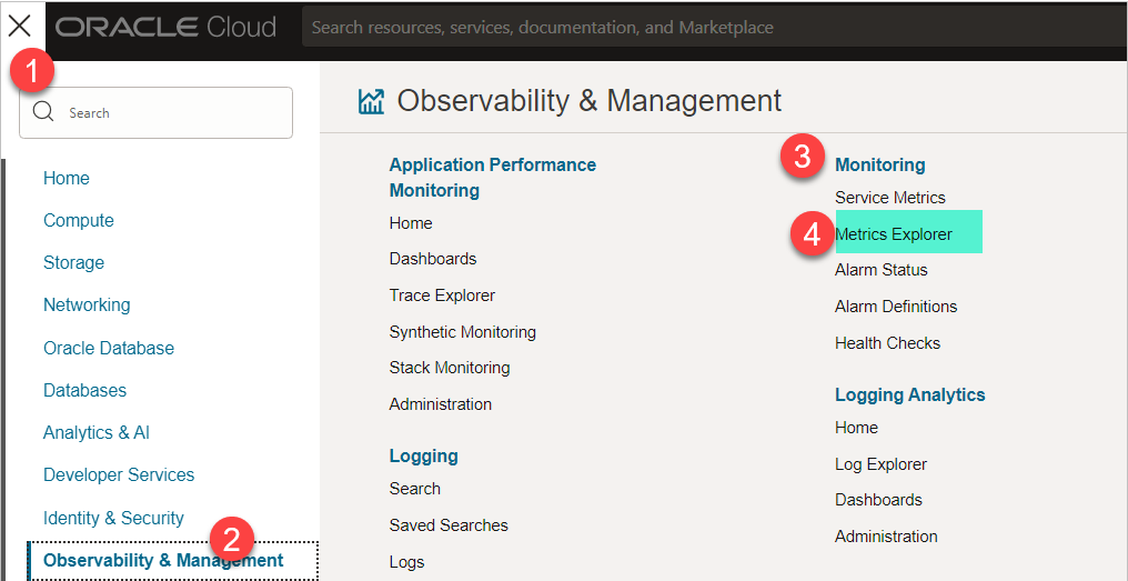
Open the OCI navigation menu and click “Observability & Management”. Under “Monitoring”, click “Metrics Explorer”.
The OCI Metric Explorer page has been divided into two portions.
- The top portion is the Graph Portion, where the graph will be shown
- The bottom portion is the Query Portion, where you will either define the query or write the query.
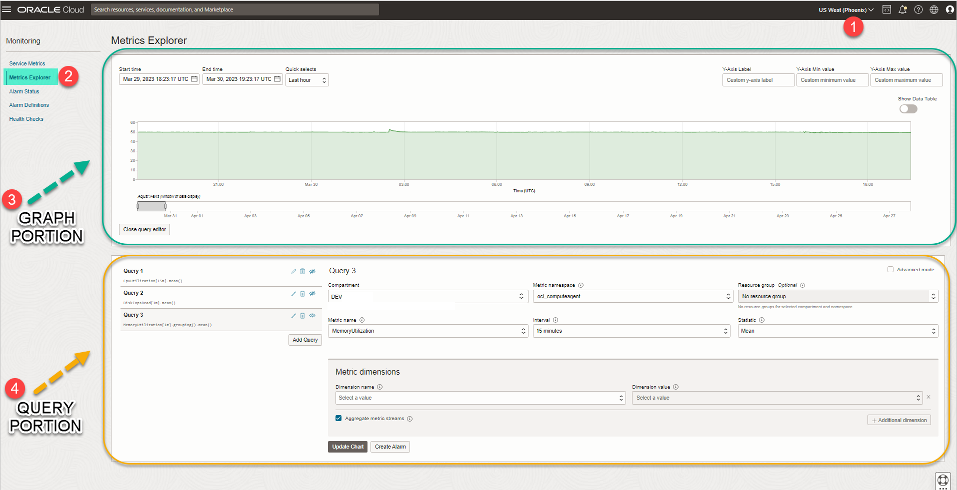 Refer to the numbered annotations in the image and consult the corresponding descriptions provided below.
1) REGION
Choose the Region as per your tenancy
2) METRICS EXPLORER
Choose the metrics explorer section.
3) GRAPH PORTION
The top portion is the Graph Portion, where the graph will be shown
4) QUERY PORTION
The bottom portion is the Query Portion, where you will either define the query or write the query.
Let us now understand the Query Portion fields in detail:
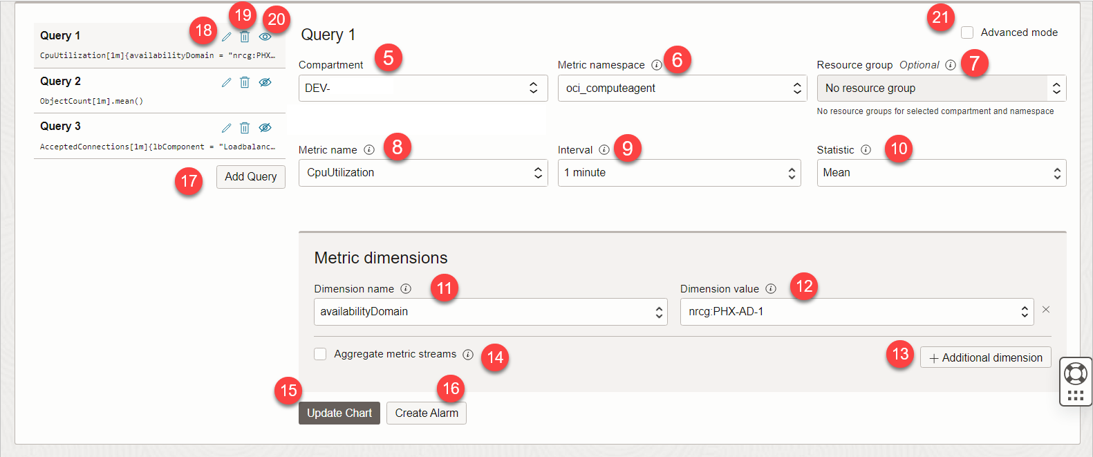
Refer to the numbered annotations in the image and consult the corresponding descriptions provided below.
5) COMPARTMENT
Choose the right compartment where you want to do analysis and you have access.
6) METRIC NAMESPACE
Select the metric namespace for querying metric data in Monitoring.
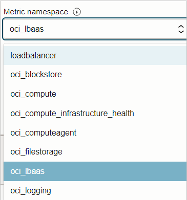
The dropdown lists metric namespaces for the selected compartment. For example, if the current compartment contains load balancers, then the page includes oci_lbaas in its list of metric namespaces as shown above.
7) RESOURCE GROUP
Limit returned metric data by matching a resource group
A resource group in Oracle Cloud Infrastructure (OCI) is a logical grouping of related resources that you can manage as a single entity. The resources within a resource group can be from different compartments and can be in different regions.
In the context of monitoring, a resource group can be used to limit the metric data returned when querying custom metric data. By specifying a resource group, you can ensure that only metric data for the resources within that group are returned, which can make it easier to analyze the data and identify trends or patterns.
Since we have no resource group so we have nothing in our resource group dropdown list.
8) METRIC NAME
Select the Metric name that you want corresponding to Metric Namespace you chose. The example below are the Metrics for the load balancer oci_lbaas metric namespace
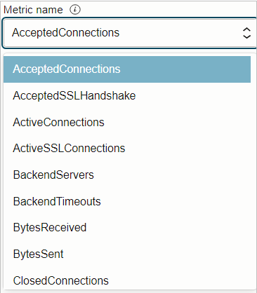
Note: The minimum required fields to view a metric chart are the Metric namespace and the Metric name.
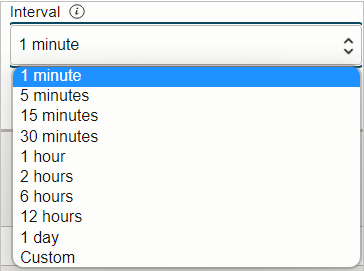
9) INTERVAL
Supported values for intervals depend on the specified time range in the metric query.
More interval values are supported for smaller time ranges. For example, if you select one hour for the time range, then all interval values are supported. If you select 90 days for the time range, then only interval values between 1 hour and 1 day are supported.
10) STATISTICS
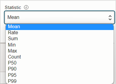
Change the query’s statistics used for aggregating data plotted on the metric chart.
- Rate: Returns the per-interval average rate of change. The unit is per-second.
- Sum: Returns all values added together, per interval.
- Mean: Returns the value of Sum divided by Count during the specified interval.
- Min: Returns the lowest value observed during the specified interval.
- Max: Returns the highest value observed during the specified interval.
- Count: Returns the number of observations received in the specified interval.
- P50: Returns the estimated value of the 50th percentile during the specified interval.
- P90: Returns the estimated value of the 90th percentile during the specified interval.
- P95: Returns the estimated value of the 95th percentile during the specified interval.
- P99: Returns the estimated value of the 99th percentile during the specified interval.
- P99.9: Returns the estimated value of the 99.9th percentile during the specified interval.
To explain by one example let us take "P95: Returns the estimated value of the 95th percentile during the specified interval"

This helps identify the value in a dataset at which 95% of the values are below it, and the remaining 5% are above it. The 95th percentile is a more extreme value compared to the median P50 and can provide insights into the higher end of the distribution.

Example dataset of 10 ages  in ascending order:
Sorted Ages: 21, 24, 25, 27, 30, 33, 35, 38, 40, 45

The 95th percentile (P95) is average of 9th and 10th positions: 42.5.

This means that 95% of the people in the room are younger than 42.5 years old, and the remaining 5% are older than 42.5 years old.
11) DIMENSION NAME
Dimension is like a FILTER
Limit returned metric data by selecting dimensions when querying metric data in Monitoring.
The example below is the dimension name for the Load Balancers.
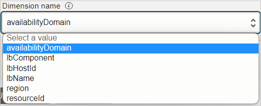
Note: Long lists of dimensions are trimmed. To view dimensions by name, type one or more characters in the box. A refreshed (trimmed) list shows matching dimension names.
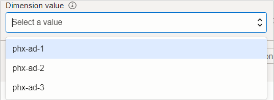
12) DIMENSION VALUE
The value you want to use for the specified dimension. For example, as we had chosen above “availability domain” as the dimension name so the dimension value has the list of availability domains.
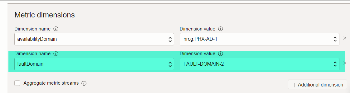
13) ADDITIONAL DIMENSION
Adds another name-value pair for a dimension.
For example below, we wanted to be more specific so we added a new filter for Fault Domain.
14) AGGREGATE METRIC STREAMS
Returns the combined value of all metric streams for the selected statistic. This option is equivalent to the grouping() query component.
The Aggregate metric streams option is equivalent to grouping() in the MQL expression.
By default, a chart represents each metric stream with a line, which results in multiple lines per chart. When you aggregate metric streams, a chart represents all metric streams with a single line, which results in just one line per chart.
For example, when we enabled it by selecting “Aggregate Metric Stream” and clicking “Update Chart”, it converted the graph to a single-line kind of graph by aggregating all the data.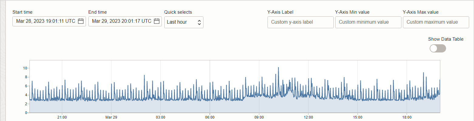
15) UPDATE CHART
If you make any changes in the query, you need to click the “update chart” button. After clicking the update button only the chart will show metric data for the selected metric namespace and metric name.
16) CREATE ALARM
Creating an alarm from a query involves adding a condition, or trigger rule, to the query and setting up notifications.
We will learn about Alarm management in the coming blog posts.
17) ADD QUERY
To add a query, click Add Query and fill in the configuration.
18) EDIT QUERY
Edit a query used to generate the metric chart the Metrics Explorer page in the Console
If there is more than one query, then click Edit query (Edit query) for the one that you want.
Update the fields that you want. Click Update Chart.
19) DELETE QUERY
To delete a query, click Delete query (Delete query).
20) TOGGLE QUERY ON CHART
To hide a query, click Toggle query on the chart (Toggle query on the chart).
For example, if you have multiple queries and you want to see the graph of only one then toggle hide other ones and only enable the one you want to see.
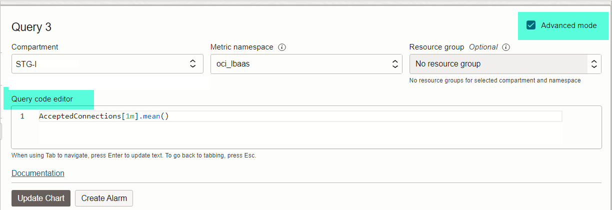
21) ADVANCED MODE
By clicking advanced mode, you can edit the text in the Query code editor in Monitoring Query Language (MQL)
Let us now understand the Graph Portion fields in detail:
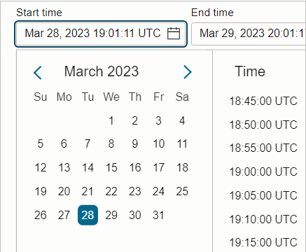
22) START TIME
Set the bounds, or timestamps, of the metric data that you want for the metric chart on the Metrics Explorer page in the Console. By default, charts show the last hour of metric data.
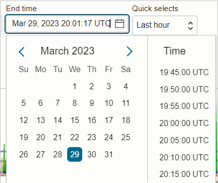
23) END TIME
Set the bounds, or timestamps, of the metric data that you want for the metric chart on the Metrics Explorer page in the Console. By default, charts show the last hour of metric data.
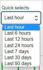
24) QUICK SELECT DURATION
Select a period of time from Quick Selects. For example, Last hour.
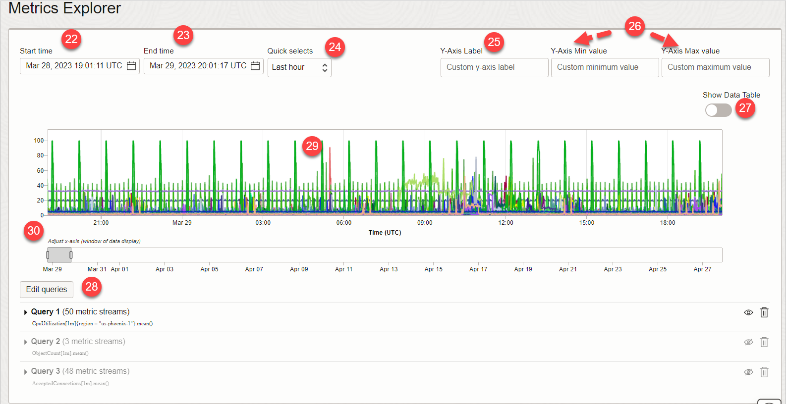
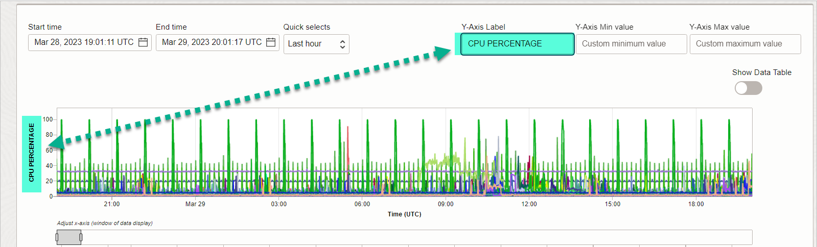
25) Y-AXIS LABEL
Enter your custom labels for the y-axis in the metric chart on the Metrics Explorer page in the Console.
For example, as shown below we wanted to give a proper name to the Y-AXIS
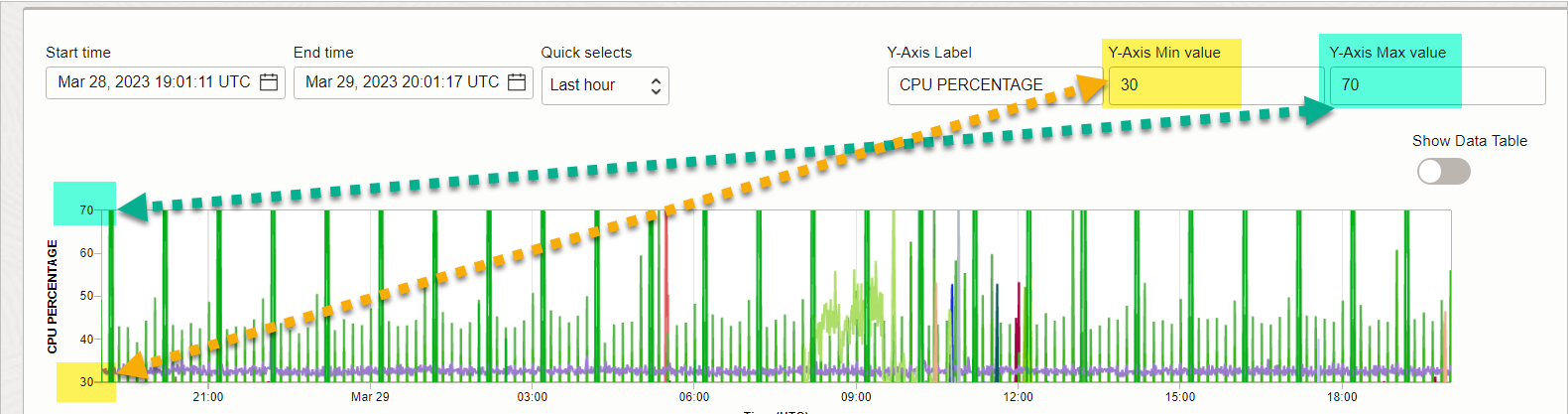
26) Y-AXIS MIN AND MAX VALUE
- Y-Axis Min value: Custom minimum value for the y-axis of the metric chart. Use numeric characters.
- Y-Axis Max value: Custom maximum value for the y-axis of the metric chart. Use numeric characters.
For example, below we wanted to see which servers were in the range of 30% to 70% CPU consumption.
27) SHOW DATA TABLE
Click “Show Data Table” toggle.
After you click it, it will get enabled and the toggle will convert into “show graph”
The metric data is now presented as a table. Example excerpt: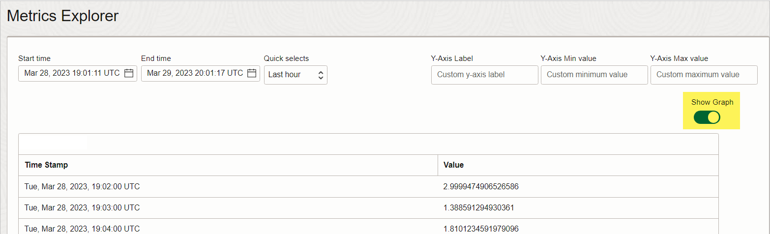
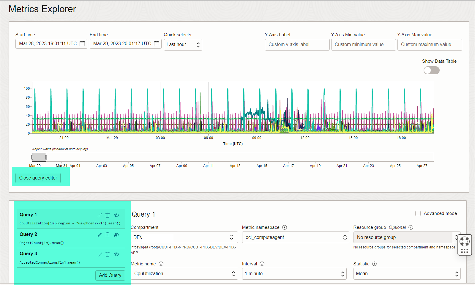
28) EDIT QUERIES
Clicking “Edit queries” will open below the Queries Portion.
And as you can see below we have two example queries and under each query label (“Query” followed by a number) is the corresponding query, shown as a Monitoring Query Language (MQL) expression.
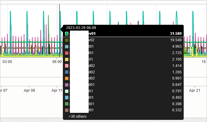
29) GRAPH
If you hover above graph section, then in a new floating window it will show the list of resources depicted by the color in the graph. Example, you can easily locate which server in the compartment is hitting high CPU.
30) ADJUST X AXIS (WINDOW OF DATA DISPLAY)
You can drag the bar to change the time range of the Graph easily.
This is one of the posts in the Oracle Cloud Infrastructure (OCI) Monitoring Series. Click on the below links to read more posts from the series:

- Oracle Database Service for Azure (ODSA) 3 – Database Services - May 1, 2023
- Oracle Database Service for Azure (ODSA) 2 – Interconnect Details - April 30, 2023
- Oracle Database Service for Azure (ODSA) 1 – Fundamentals - April 29, 2023