In this post, we will see how to view metric charts that use predefined service queries. Default metric charts are available on the Service Metrics page and under Metrics on resource detail pages in the Console.
The Service Metrics page displays default charts for all resources in the selected region and compartment that emit metric data to the selected metric namespace.
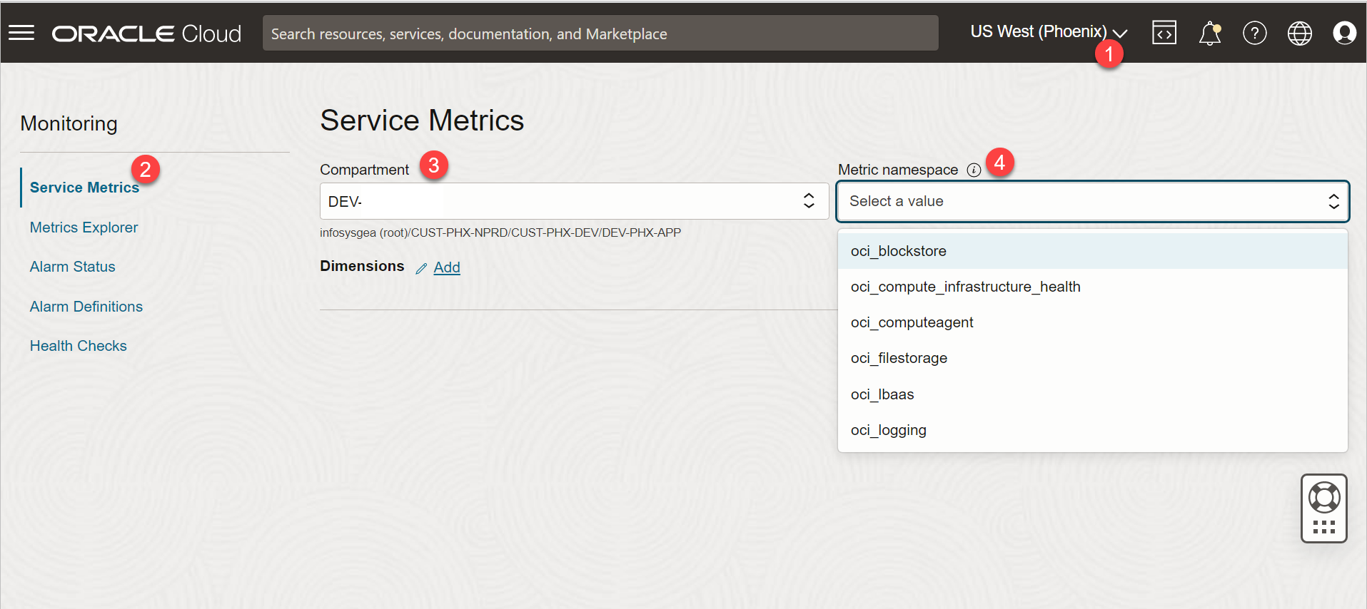
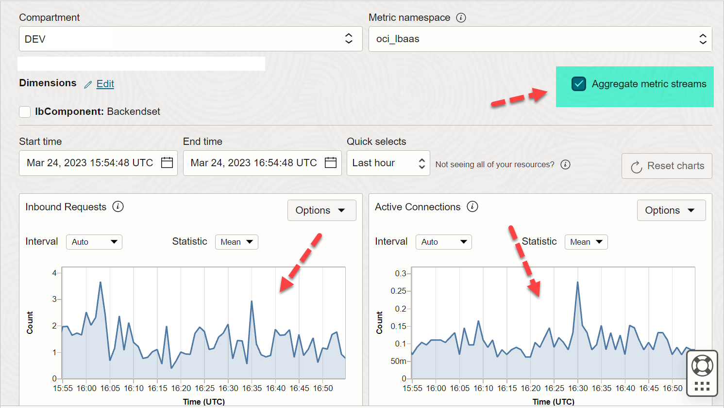
Refer to the numbered annotations in the image and consult the corresponding descriptions provided below.
1) REGION
From the Console header, select the region that contains the metric data that you want.
2) SERVICE METRIC
Open the navigation menu and click Observability & Management. Under Monitoring, click Service Metrics. The Service Metrics page opens.
3) COMPARTMENT
Choose a compartment that you have permission to work in and where you want to see metric
4) METRIC NAMESPACE
Choose the Metric namespace for the resource types of interest.
For example, choose oci_lbaas to see metrics for load balancers.
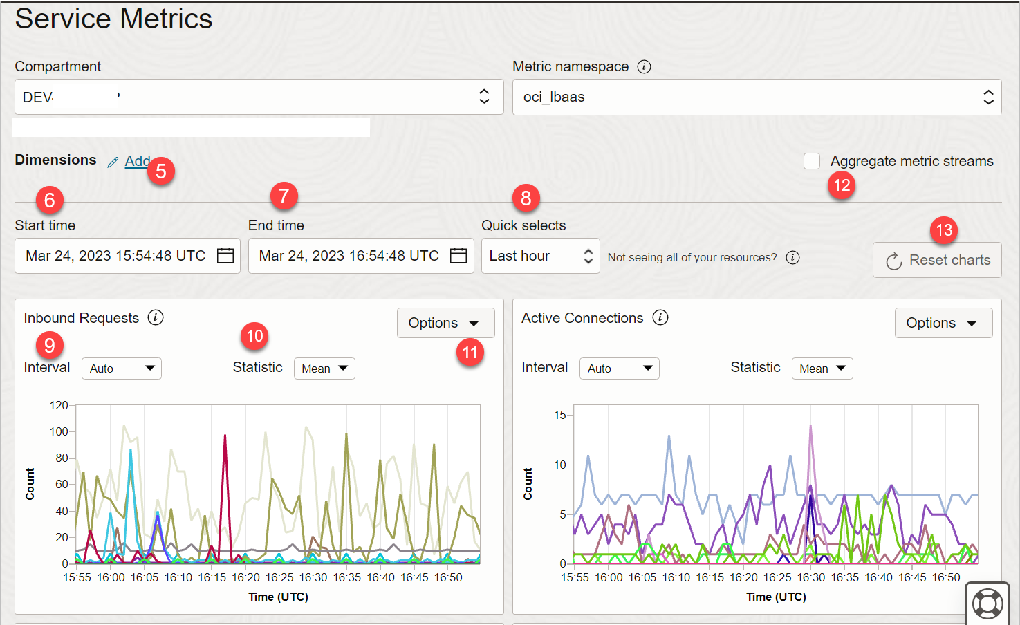
5) DIMENSIONS
Select dimensions to filter data plotted on default metric charts on the Service Metrics page in the Console.
For example below, for our load balancer resource, dimension name drop down has many filters.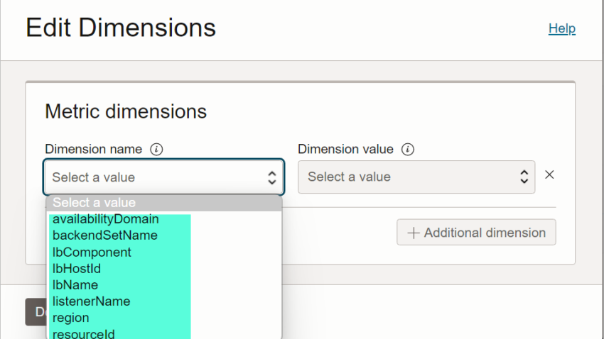
And for each filter name, we have many values.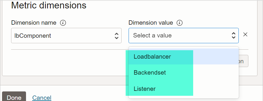
So in the below graph, we chose ‘lbComponent” FILTER to show graphs for the “Backendset”.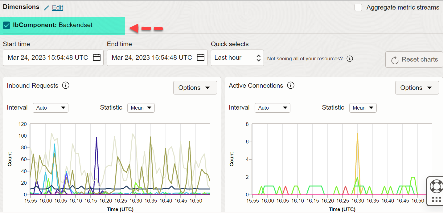
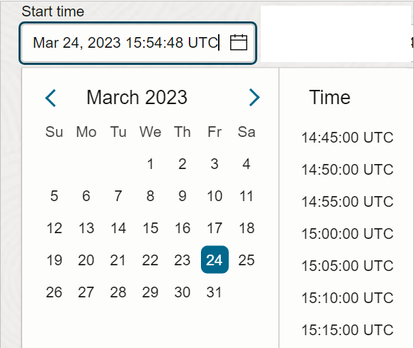
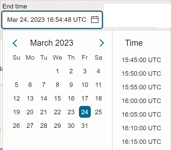
6) START TIME
Set the bounds, or timestamps, of the metric data that you want for default metric charts. By default, charts show the last hour of metric data. use START TIME and END TIME as per need.
7) END TIME
8) QUICK SELECTS
You can give a start or end time manually or you can choose quickly select a pre-defined interval value.
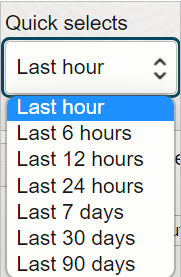
Select a period of time from Quick Selects. For example, “Last hour”.
9) INTERVAL
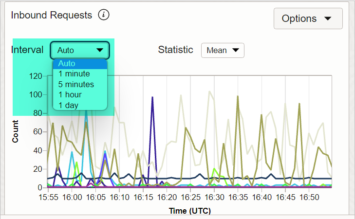
Change the time window for aggregating metric data points plotted on a default metric chart.
Auto is default.
Auto – automatic interval selection based on time range (End Time – Start Time):
- If the time range is 6 hours or less, then the interval in AUTO will be 1 minute.
- If the time range is 36 hours or less (but more than 6 hours), then interval in AUTO will be 5 minutes.
- If the time range is More than 36 hours, then interval in AUTO will be 1 hour.
10) STATISTICS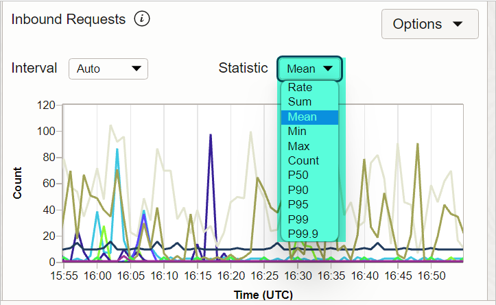
Change the query’s statistic used for aggregating data plotted on a default metric chart.
- Rate: Returns the per-interval average rate of change. The unit is per-second.
- Sum: Returns all values added together, per interval.
- Mean: Returns the value of Sum divided by Count during the specified interval.
- Min: Returns the lowest value observed during the specified interval.
- Max: Returns the highest value observed during the specified interval.
- Count: Returns the number of observations received in the specified interval.
- P50: Returns the estimated value of the 50th percentile during the specified interval.
- P90: Returns the estimated value of the 90th percentile during the specified interval.
- P95: Returns the estimated value of the 95th percentile during the specified interval.
- P99: Returns the estimated value of the 99th percentile during the specified interval.
- P99.9: Returns the estimated value of the 99.9th percentile during the specified interval.
To explain by one example let us take "P95: Returns the estimated value of the 95th percentile during the specified interval"


This helps identify the value in a dataset at which 95% of the values are below it, and the remaining 5% are above it. The 95th percentile is a more extreme value compared to the median P50 and can provide insights into the higher end of the distribution.

Example dataset of 10 ages  in ascending order:
Sorted Ages: 21, 24, 25, 27, 30, 33, 35, 38, 40, 45

The 95th percentile (P95) is average of 9th and 10th positions: 42.5.

This means that 95% of the people in the room are younger than 42.5 years old, and the remaining 5% are older than 42.5 years old.
11) OPTIONS
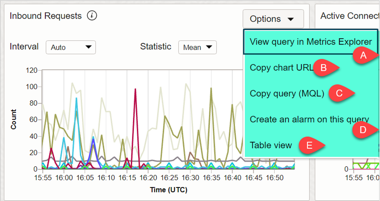
A) VIEW QUERY IN METRIC EXPLORER
Open the query for a default metric chart in the Metrics Explorer page. We will discuss more on Metrics Explorer page in next page.
In Metrics Explorer page, you can update the query, and immediately see effects of the update on the metric chart.
B) COPY CHART URL
Share a default metric chart from the Console. The person you share the chart with must have the required IAM policies for access to metrics.
C) COPY QUERY (MQL)
Copy the predefined service query used in a default metric chart.
Example for above graph you will get below kind of MQL Query:
HttpRequests[1m].grouping().mean()
D) CREATE AN ALARM ON THIS QUERY
Create an alarm based on the predefined service query used to generate a default metric chart.
We will see in the next blog posts how to create an alarm.
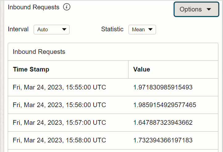
E) TABLE VIEW
The metric data is presented as a table.
To switch back to a chart view, click Options and then select Chart View
12) AGGREGATE
Aggregate metric streams in default metric charts on the Service Metrics page in the Console by selecting the tick mark as shown below. Aggregating metric streams combines multiple data streams into one, making it easier to analyze trends and patterns in the collected data for ALL selected resources TOGETHER.
As shown below multiple graphs for multiple load balancers shown at the start of this blog post are now showing up as single lines.
13) RESET CHART
On the upper right of the page, click Reset charts.
To go back to default settings for default charts.
This is one of the posts in the Oracle Cloud Infrastructure (OCI) Monitoring Series. Click on the below links to read more posts from the series:

- From Chat to Autonomous Agents: A Maturity Model for DBA AIOps - April 27, 2026
- Query Catalog Pattern for Natural Language to SQL: Frontmatter-Driven Routing - March 22, 2026
- Safe Ansible Automation for AI Chat: A Guardrail Framework - February 3, 2026